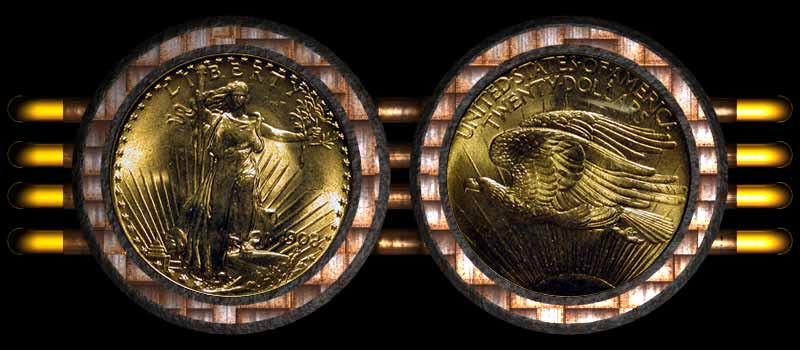
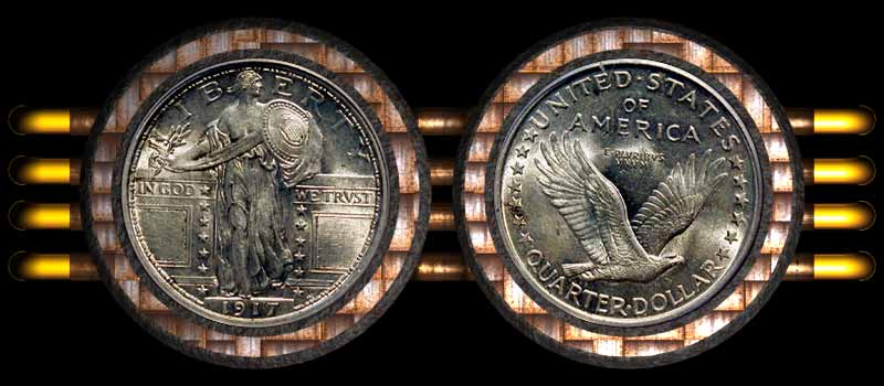
I think the background distracks from the coin the (checker looking part) I like the gold bars, looks good but too much for my eye, takes the eye away from the coin, it might look good solid black, but its just my opinion
The coins look beautiful but I also think they look a little dark. It appears as though they've been nailed to a natural cedar shingle house, isn't that what Mercs are used for?
The border around that Saint reminded me of a orange/white bank roll. Sure like to find a roll of those.
I also find the borders and additional graphics distracting from the coins. I'd think a bright coin set on black (gold/silver) would look nice, and copper coins set on a bright/light color.
 cosmicdebris
Posts: 12,333 ✭
cosmicdebris
Posts: 12,333 ✭

Comments
Cool Back Ground but the Coin is Too Dark. For Sure it does not look like that in Person.
IMVHO.
"Because I can"
myurl The Franklin All Old Green Holder Set
Nice and I Really Punctuate This "Nice Coin"
It Was Not There.
My Dimes
<< If it's worth doing, it's worth doing right the first time! >>
In honor of the memory of Cpl. Michael E. Thompson
I also find the borders and additional graphics distracting from the coins. I'd think a bright coin set on black (gold/silver) would look nice, and copper coins set on a bright/light color.
09/07/2006