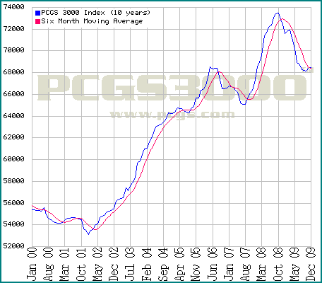
Heres another chart, PCGS 3000 ten year
 ambro51
Posts: 14,080 ✭✭✭✭✭
ambro51
Posts: 14,080 ✭✭✭✭✭
Heres another chart.
This one should be taken seriously, probably a better market indicator than one that specializes in different coin groups or includes the bubble.
What I see here is the current trendline breaking over the moving average (a good thing) and also this low forming higher (or just about on level with) the previous high (before the prior downturn).
So this broke the possibility of a head and shoulders forming (which is a bad thing) and based on past results crossing the moving average on an upturn has signaled a buying opportunity for the next leg up. I think we are at that point now.
Of Course I could be dead wrong about all that and no doubt others will read this chart differently.
0
Comments
<< <i>Heres another chart.
This one should be taken seriously, probably a better market indicator than one that specializes in different coin groups or includes the bubble.
What I see here is the current trendline breaking over the moving average (a good thing) and also this low forming higher (or just about on level with) the previous high (before the prior downturn).
So this broke the possibility of a head and shoulders forming (which is a bad thing) and based on past results crossing the moving average on an upturn has signaled a buying opportunity for the next leg up. I think we are at that point now.
Of Course I could be dead wrong about all that and no doubt others will read this chart differently.
The easiest thing to learn about reading charts is to make an ARROW POINT at the end of the moving average. The direction that it points will usually tell you where it is going. Of course this will get you in above bottoms and out below tops, but it is a simple tool that will keep your short term trade from becoming a long term hold.
Knowledge is the enemy of fear
<< <i>If the overall trendline continues for ten years it will be at about 100,000. Im not sure how that translates out in real money but over ten years it looks like coins may do pretty well. Estimate every coin you own worth 40 percent more than today. Why not? Just as likely to happen as not to happen. >>
That return is about the same as buying a 10 yr treasury bond. But you can hold your coins and the US will default on your bond.
Knowledge is the enemy of fear
<< <i>That return is about the same as buying a 10 yr treasury bond. But you can hold your coins and the US will default on your bond.
How many Yuan will you collection then be worth?
<< <i> << That return is about the same as buying a 10 yr treasury bond. But you can hold your coins and the US will default on your bond. >> >>
Or they'll print so much money they'll be worth their weight in paper