Options
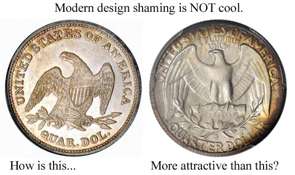
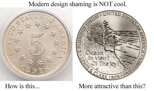
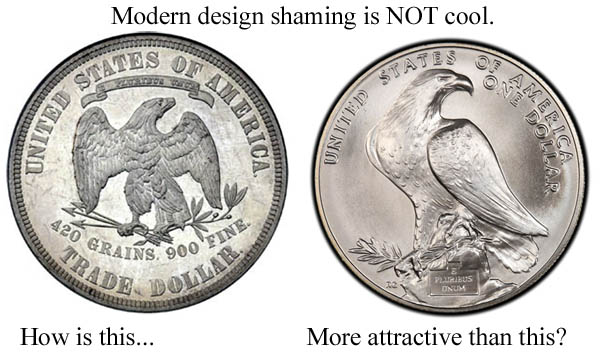
A case for modern design...
 kiyote
Posts: 5,568 ✭✭✭✭✭
kiyote
Posts: 5,568 ✭✭✭✭✭
Here's a couple of examples, but I'm sure there's a lot more..
"I'll split the atom! I am the fifth dimension! I am the eighth wonder of the world!" -Gef the talking mongoose.
0
Comments
<< <i>the almost-flat relief of most modern US design is quite unappealing. >>
That classic 5 cent piece isn't exactly jumping with relief and that modern dollar looks like it has reasonable relief.
MORE DENTILS!
there is an interesting comparison which can be made with regard to the way modern designs are rendered and the appearance of that Shield Nickel reverse --- problems with production. when the Mint initiated the W/Rays design there was obvious difficulty with the Nickel alloy so the Rays were removed. with Modern issues it is simply that to produce hundreds of millions of coins certain concessions need to be made, low relief being one of them. the twist is that with better steel for the dies today some intricate designs can be done, just not in the numbers needed for commerce. I have always wondered how they were able to strike the Shield Nickel obverse with the fine detail required, but I have seen many coins where the dies had failed and must have eventually shattered.
somewhere, somehow, there has to be a middle ground which would give us inspired designs in large numbers. attempts have been made and rejected, so I have to believe that it is the "power" which has the final decision that is to blame.
The 2nd most beautiful coin ever minted
3rd most beautiful coin ever minted
Of course these are JMHO,,,,,
GrandAm
<< <i>the almost-flat relief of most modern US design is quite unappealing. >>
The OP has a valid point, but I think Barndog hit the nail on the head.
The classic nickel is an obvious loser in the contest, but where are the details in the feathers on the modern eagles?
As for the Old Washington Quarter I have disliked it since I was a kid. It is flat and crowded made worse by the fact that Mrs. Laura Fraser got cheated out of her chance to design the coin. It was the one modern coin that never interested me when I was starting out as a collector.
I never cared for the 1984 Olympic eagle. To me it looked twisted and odd. So I'll take the Trade Dollar eagle which also appeared in a similar way on the Twenty Cent Piece.
Also, a lot of the modern coins seem to have the flattest reliefs ever whereas many older designs seem like they are chiseled, including the examples you show...besides the shield nickel of course.
Looking for Top Pop Mercury Dime Varieties & High Grade Mercury Dime Toners.
Looking for Top Pop Mercury Dime Varieties & High Grade Mercury Dime Toners.
<< <i>As for the Old Washington Quarter I have disliked it since I was a kid. It is flat and crowded made worse by the fact that Mrs. Laura Fraser got cheated out of her chance to design the coin. >>
I never liked Frazer's design. To me it showed a grumpy-looking Washington, a squashed motto behind Washington's head, and a date that was too small and too far to the left. At least the 1999 Washington $5 gold featured a larger and better positioned date.
My Adolph A. Weinman signature")
