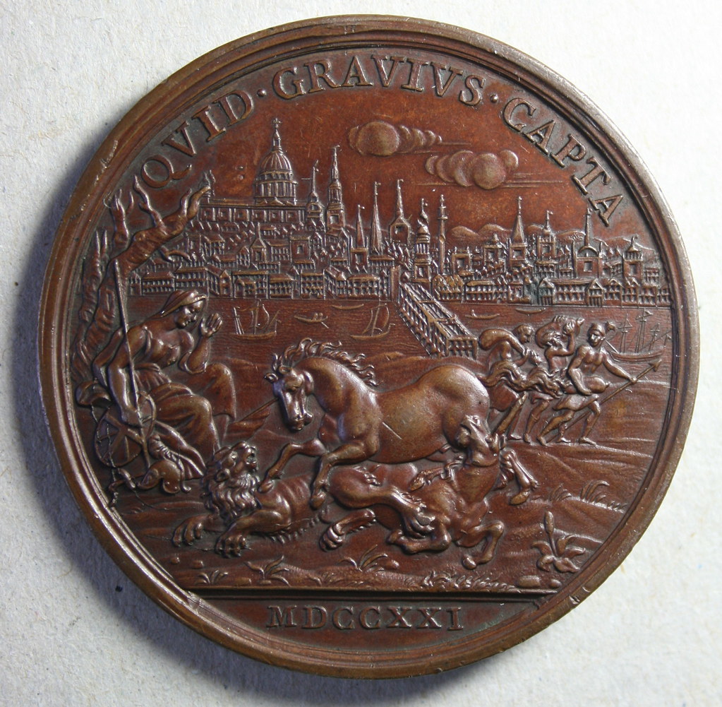
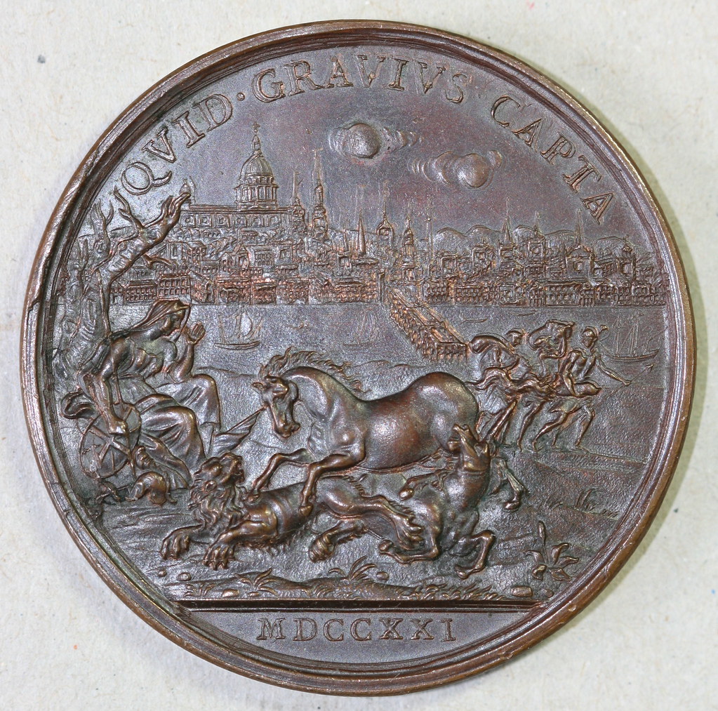
I've been trying to compare the die cracks, and they look slightly different to me. I wonder if the cracks, though in the same location, came as a result of the design causing weakness at that point on the die. I'm looking especially where the crack comes from the top and crosses over onto the shield:
There also seems to be several other small differences between the two scenes (e.g., on the helmet, a vertical line from the helmet, a vertical line from the lion's head).
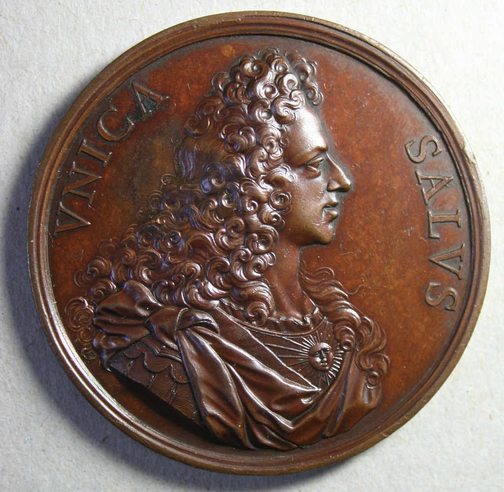
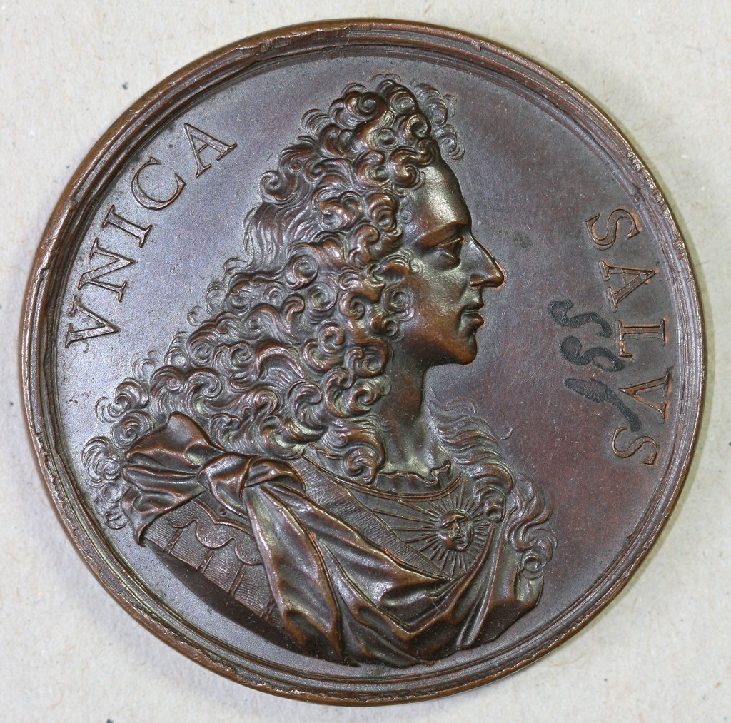
On the obverse, the second medal shows some waviness an the bottom of the serifs, while the first medal appears flat across:
However, in the middle of the "N", there looks to be a slight depression which seems to appear on both.
It does appear to be a die crack. On the specimen where the image is paler (Not necessarily the medal; the images were taken at different times), the crack appears to have widened or deepened.
Honors flysis Income beezis Onches nobis Inob keesis
Second medal also has quite extensive doubling on most of the letters, whether machine doubling(which I think it is) or recuting of the dies. IMHO Olmanjon
Based on what I see the die crack is the same on both, but seems as though it is expanded/diffuse on the second medal. I'm of the opinion that it is either from a worn/polished die or a copy. I'm still debating which, though. Would museums or other conservators routinely create electrotypes of this sort of medal, as others have suggested?
 harasha
Posts: 3,079 ✭✭✭✭✭
harasha
Posts: 3,079 ✭✭✭✭✭
Comments
There also seems to be several other small differences between the two scenes (e.g., on the helmet, a vertical line from the helmet, a vertical line from the lion's head).
On the obverse, the second medal shows some waviness an the bottom of the serifs, while the first medal appears flat across:
However, in the middle of the "N", there looks to be a slight depression which seems to appear on both.
Virtus Collection - Renaissance and Baroque Medals
DPOTD
DPOTD
Olmanjon
http://bit.ly/bxi7py